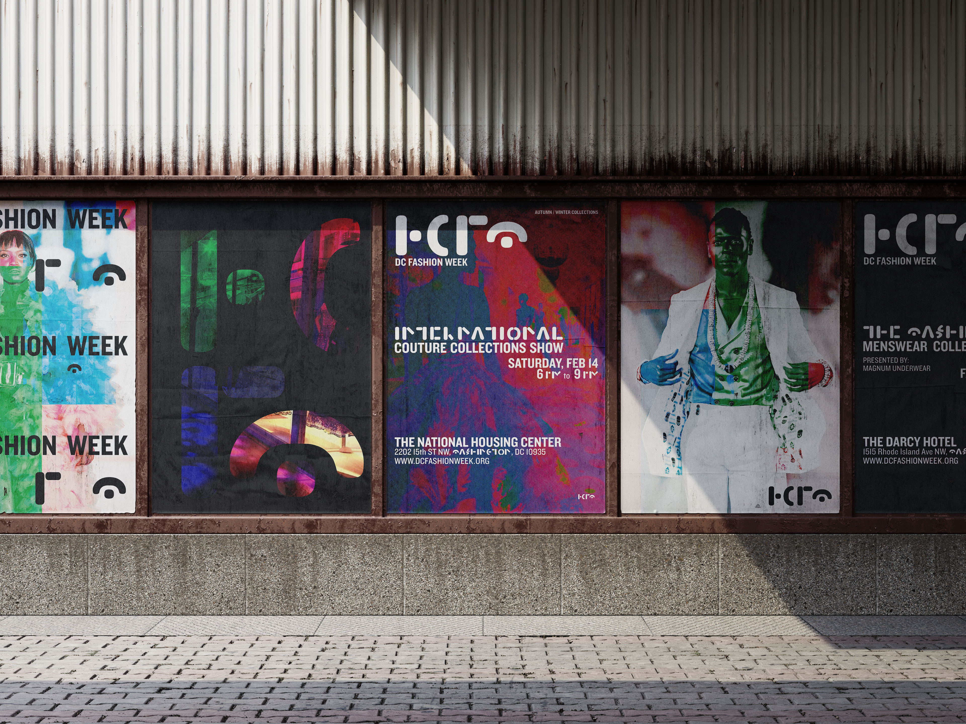
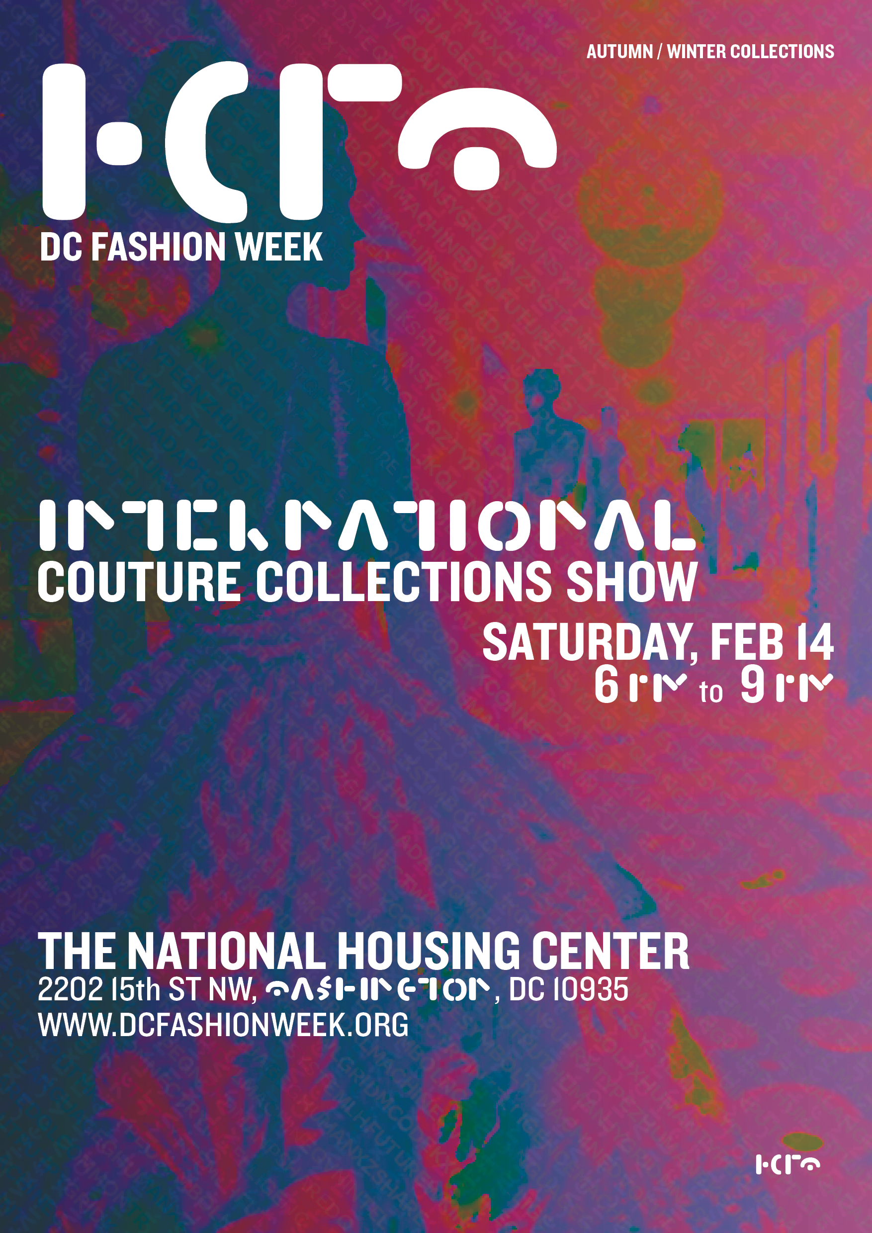
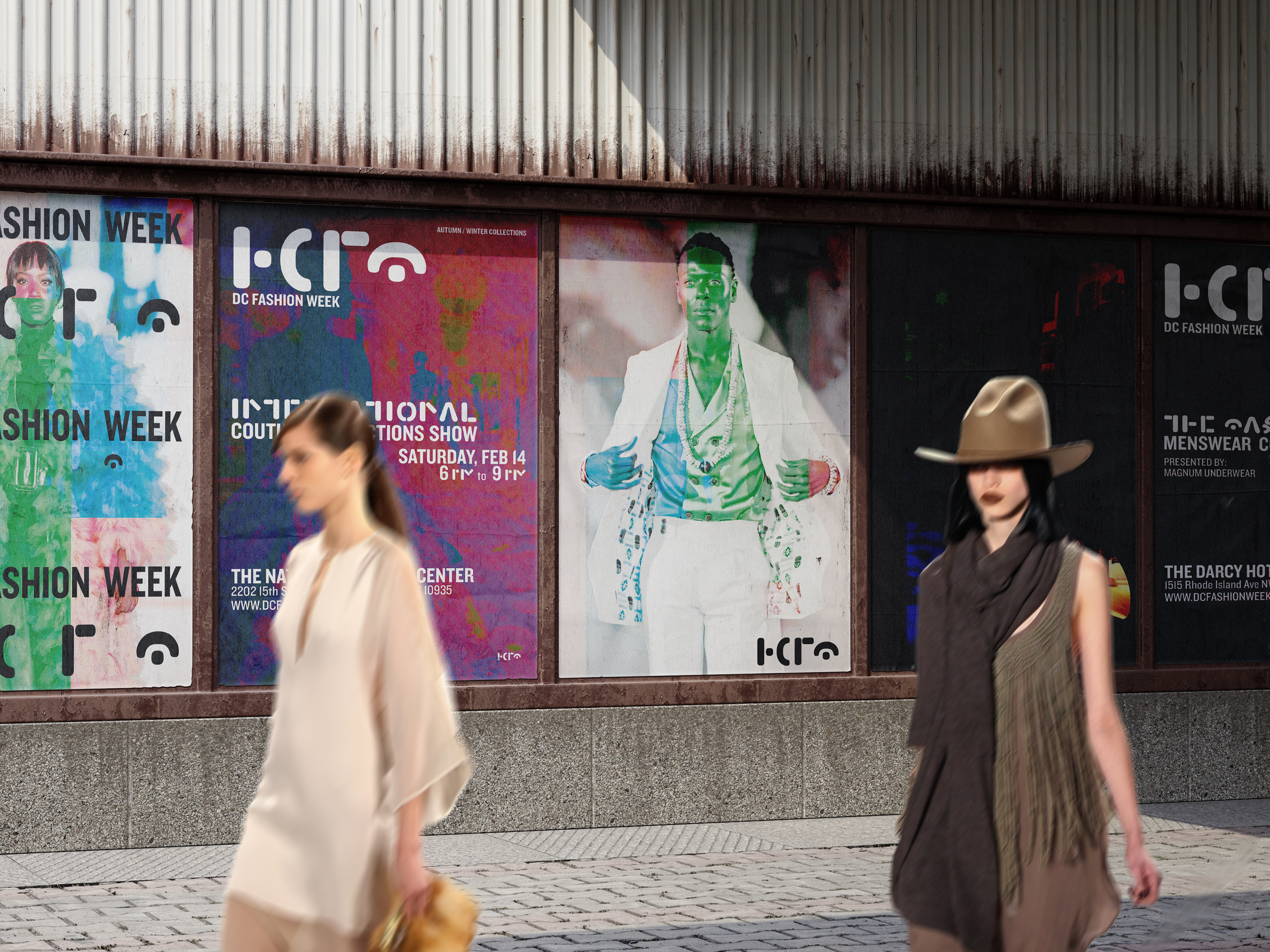
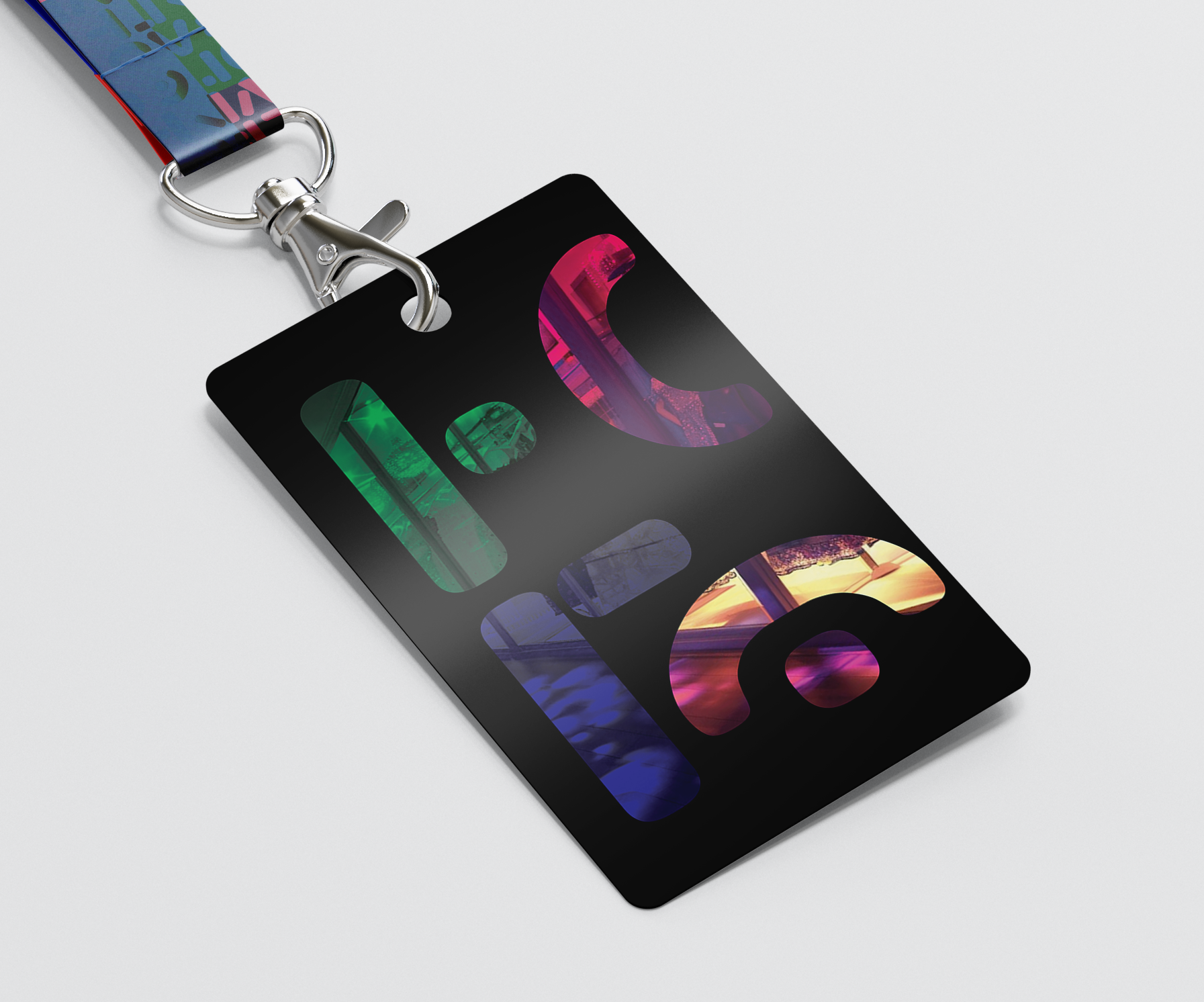
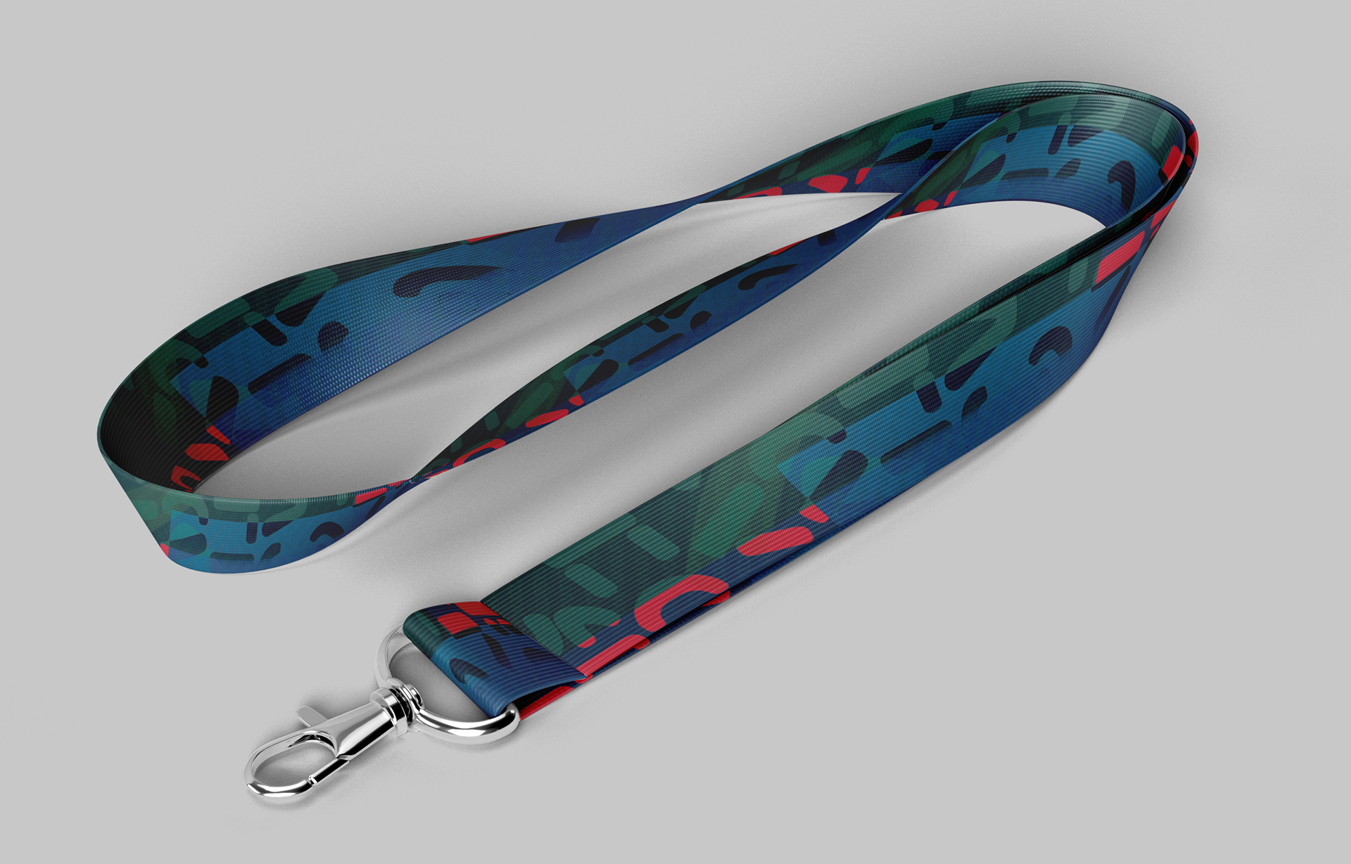
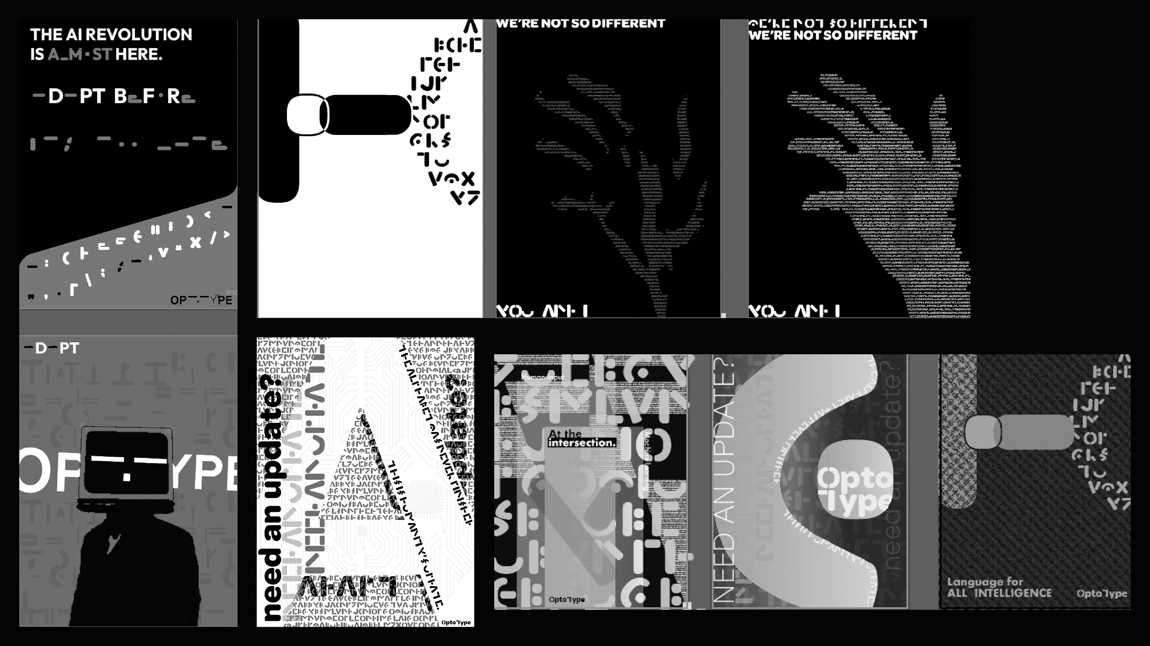
A custom typographic structure became the backbone of a complete identity system for DC Fashion Week.
Using four elemental forms, the system generates logos, titles, layouts, and motion-ready graphics.
Designed for clarity and adaptability, the identity balances strict geometry with expressive color and composition.
A unified brand built from simple parts.
Design Principles
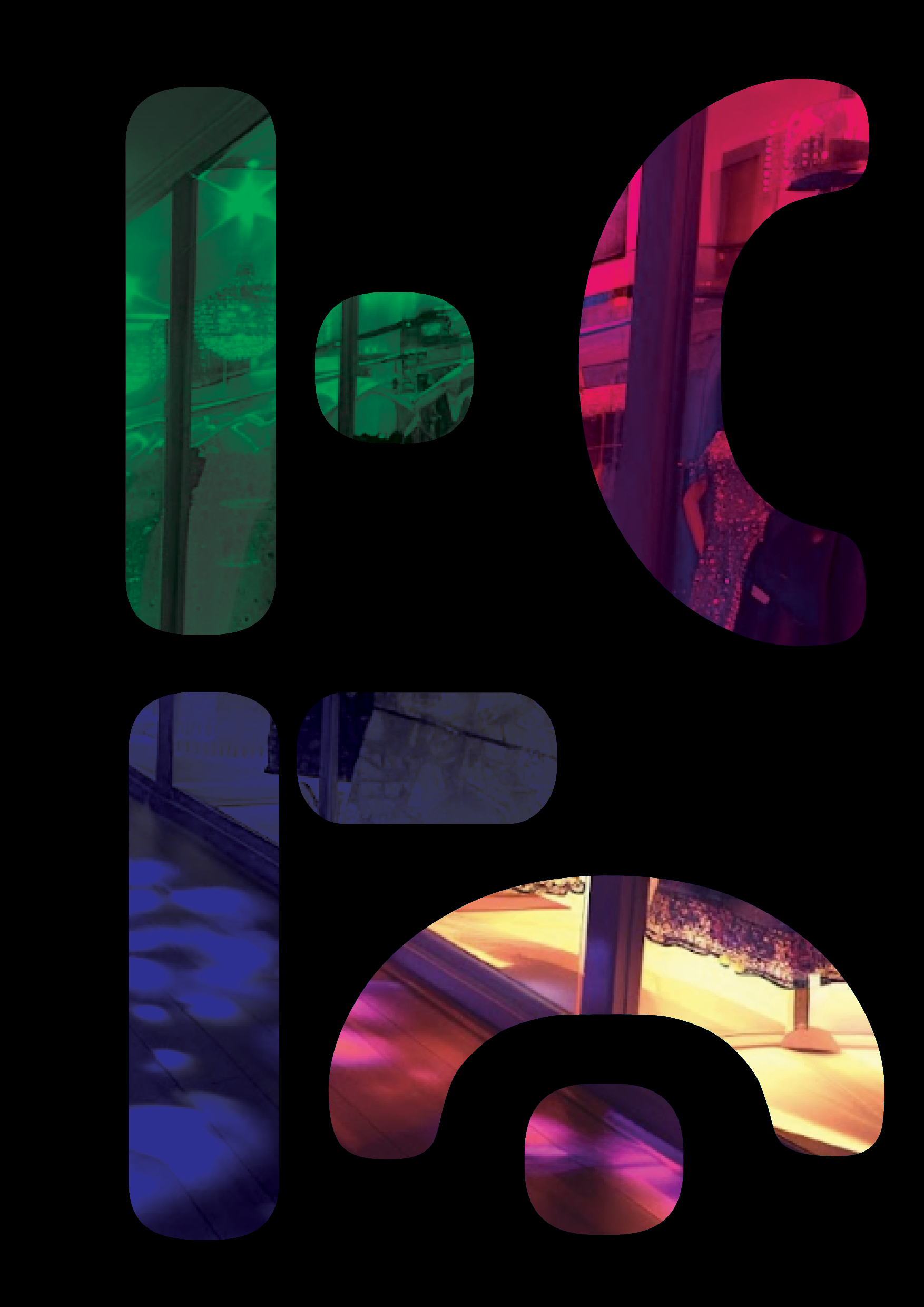
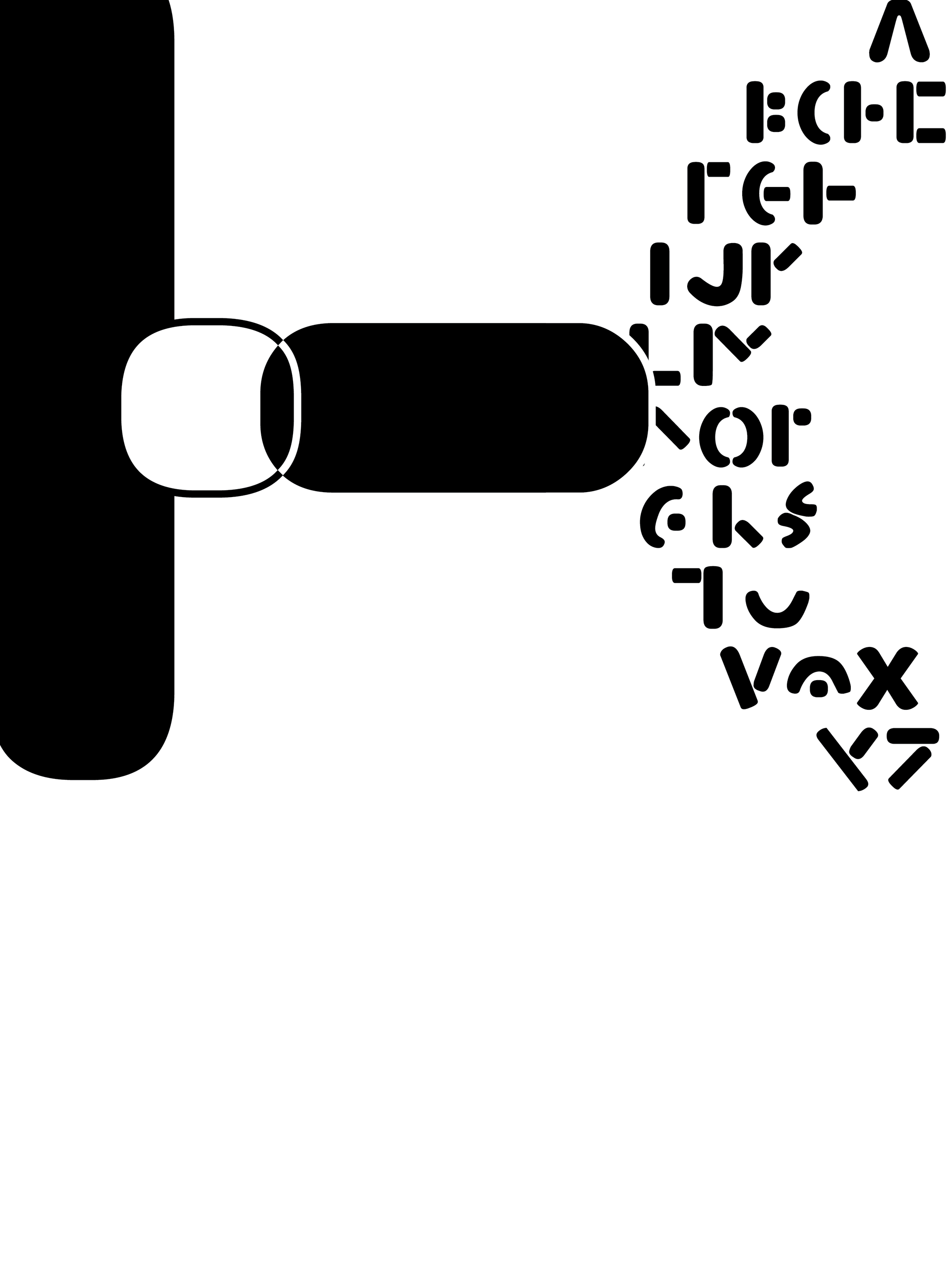
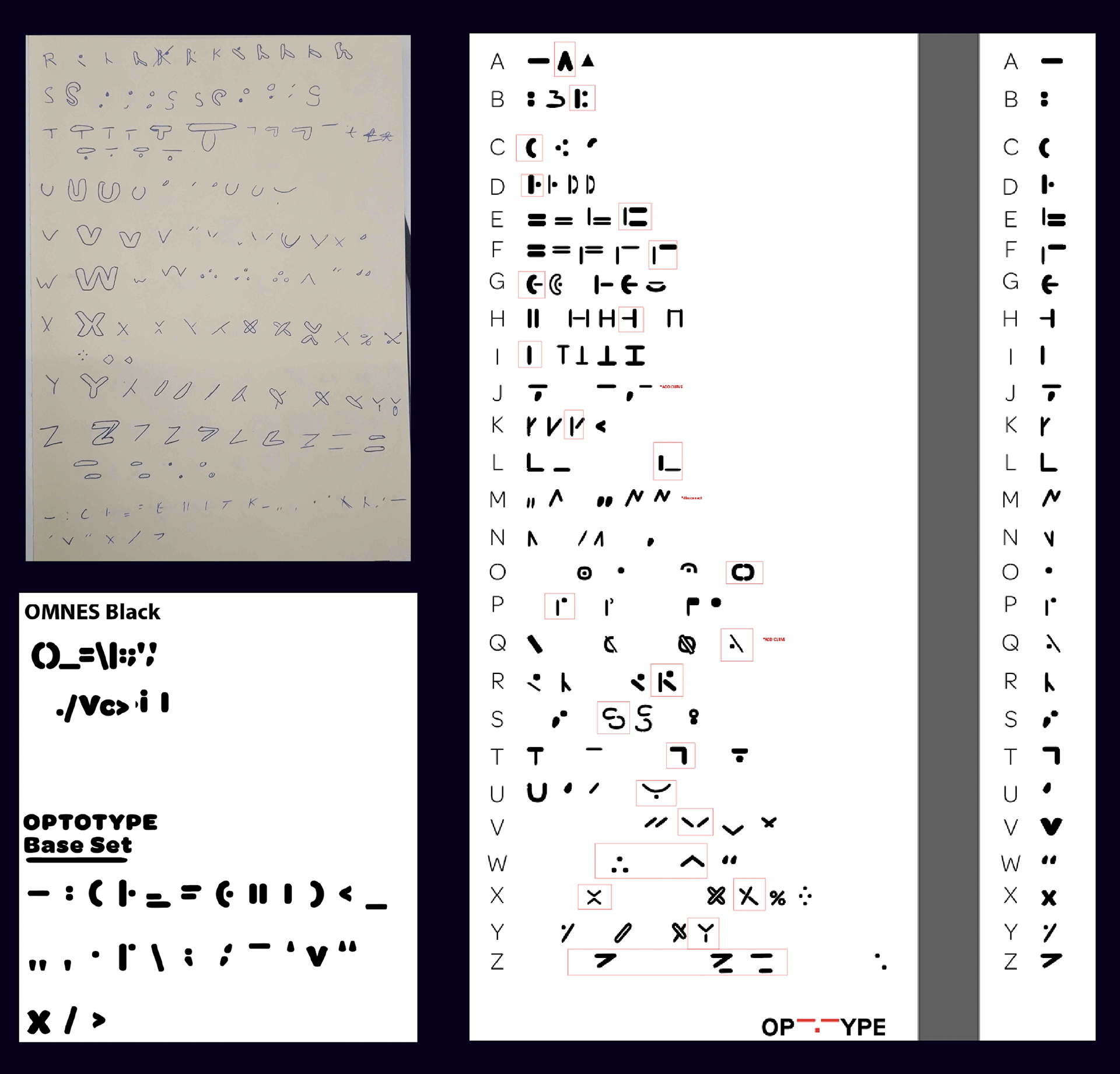
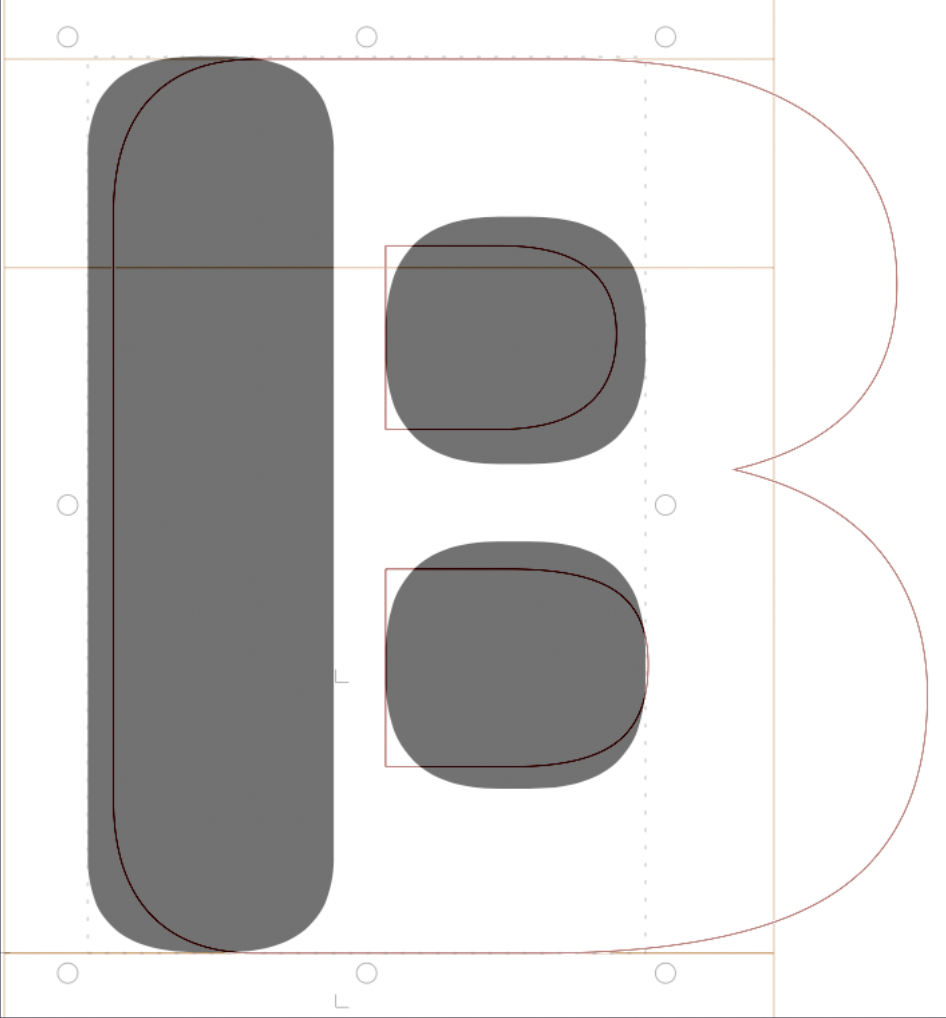
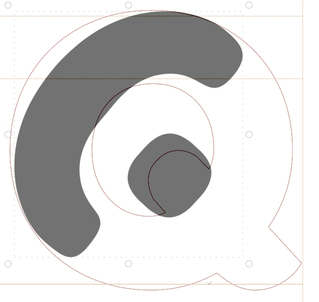
OptoType is constructed from four repeatable parts: the bar, the dot, the dash, and the curve.
Every character is derived from this grid of forms, creating a balance of logic, rhythm, and legibility. The result is a shorthand system that feels both familiar and futuristic.
Every character is derived from this grid of forms, creating a balance of logic, rhythm, and legibility. The result is a shorthand system that feels both familiar and futuristic.
Process
The design began with research into digraphic languages, shorthand systems, and speculative communication models. Early sketches tested how much information could be compressed into simplified marks.
From sketch to vector to full typeset, OptoType evolved through careful reduction; each glyph tested for both speed of recognition and consistency across the system.
From sketch to vector to full typeset, OptoType evolved through careful reduction; each glyph tested for both speed of recognition and consistency across the system.
OptoType Backend
The name came from a conversation with my optometrist. I asked if wearing glasses over time made eyesight worse. She explained that the human brain defaults to choosing the easiest path; glasses don’t weaken vision, they simply make things easier. Once accustomed to that ease, going without them feels uncomfortable.
That idea became OptoType: a type system that leans into simplicity and ease of recognition, imagining how humans and machines might converge on a shared shorthand.
Designing it taught me discipline in type design; how rhythm, consistency, and control create clarity. OptoType was about precision, a speculative system that works because it chooses the easy path forward.